The Circus is Coming
- Mar 31, 2018
- 2 min read
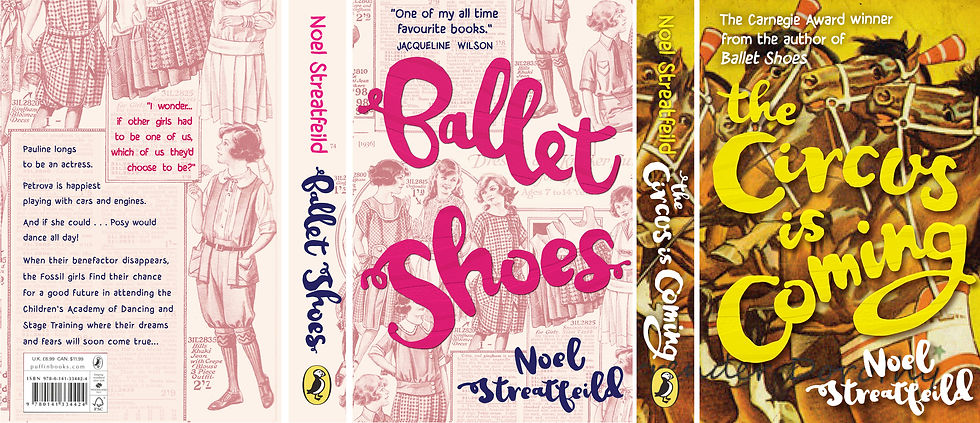
I wrote about the process of (didactically) redesigning the cover of Ballet Shoes by Noel Streatfeild, and went on to consider how I might begin to restyle the rest of her children's books using that as a lead.
I took another look at The Circus Is Coming, and... I'm not sure I'm particularly closer actually. Let's see.

My favourite is the one on the far left. The middle one is dull, and the one on the right is super creepy instead of just having the hint of not-fun-ness that I was going for.
I've given the title the same treatment to this as I did Ballet Shoes - using a base of the font JustinRoad and manipulating it. With a long title it doesn't leave a huge amount of space for the found illustration to shine through. The key part of the styling is having a confident, modern approach to cropping and framing that offsets the retro imagery.
So I like the way that in the version on the far left the acrobat's face is half cut off (hopefully not diving into the women-with-half-faces trope so big in cover design for a few years recently). But perhaps a little too much of the clown's face is being cropped, and there's not quite enough of the image visible to keep it all coherent. Maaaaybe I don't have to keep the byline locked in place from Ballet Shoes, that would give me a bit more freedom...
I also tried going back to my favourite of the images from before, the performing horses with spooked faces:


And like... sort of? But not quite. One to put to bed and come back to, there's definitely something amongst this, I just need to see it all with fresh eyes.


Comments