
Cover Practice: Discworld
- May 12, 2022
- 2 min read
These are from last year but I never wrote about them here.
I have an ongoing interest in the way Terry Pratchett's Discworld books are covered with a particular preoccupation about series branding.
In my own anecdotal experience I have formed the sense that one thing that puts potential new readers off engaging with Discworld is the sheer number of books, or more specifically the samey-ness of presentation.
There's obvious benefits to heavy author/series branding in fiction publishing, but I do question whether it has in some ways started to become a hinderance these books as much as a help. For one thing, looking at a shelf - or shelves - full of visually matching books doesn't connote of high literary standards. It makes one think of churned-out series stuff for children or undiscerning genre nerds - Beast Quest, or Goosebumps or Dragonlance or something.
For another it encourages the idea that Discworld is a series, rather than what it really is, which is a shared universe. A series of forty+ books is a daunting proposition. It also suggests that the correct way to engage with the books is to start with 'book one', The Colour of Magic.
The Colour of Magic is not a bad book but it's not very representative of Discworld. And as the years pass it becomes more and more inaccessible to new readers, being founded on parody of 80s fantasy tropes and books that aren't very recognisable any more.
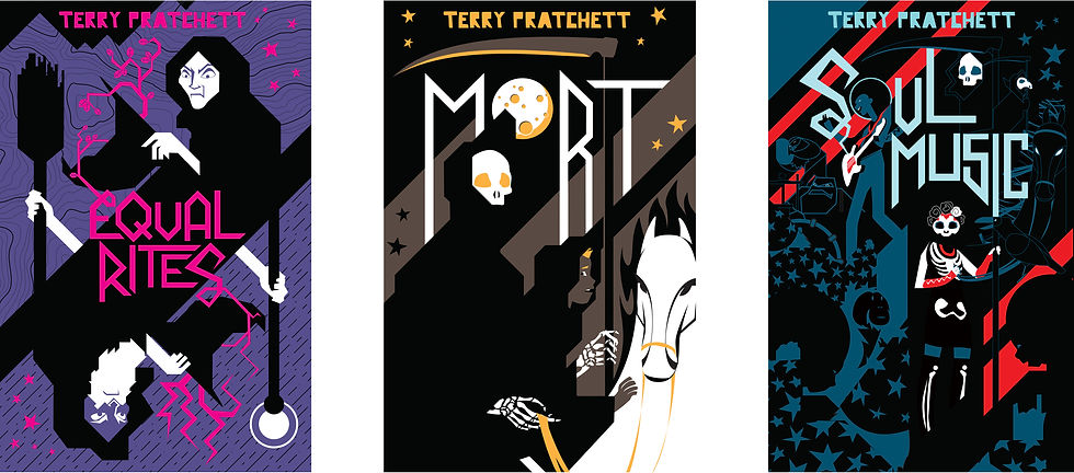
So what I've always wanted to see are editions of the Discworld books which break away from having such a singular series style and instead have separate visual identities for different strands.
But that's all context. This, specifically, is the thought that I can also imagine some of the Discworld books being selected as the clear 'YA crossover' entry points.
In addition to the existing Discworld novels which are overtly for younger readers and stocked in that section (The Amazing Maurice and the Tiffany Aching books) there are four or five others that feature child or teenaged protagonists in coming-of-age tales. Why not publish this selection in youthful covers to be shelved n the children's/teens' section?
The design brief in this scenario, I think, would be to create covers that look very distinct from Pratchett's standard look.
At the same time I'm always wary of being too reactive - you don't want to end up looking embarrassed of what the books are.
So the style I arrived at was still illustrative but a complete departure from the hand-painted, detailed, rich illustrations of classic Pratchett cover artists Paul Kidby or Josh Kirby. There's a touch of 80s retro in the palettes which I think nods to the books' vintage as a positive quality.


Comments