
Spring development
- Nov 20, 2017
- 2 min read
Time to design the Spring poster campaign, and while I have a few ideas I'm drawn in particular to an idea that I began for Summer 2017 before it was superseded by another direction - the Ravilious-inspired one sketched out in this post.

As I mentioned before it would fit into a certain house style I've developed in my time at Waterstones, that of a single large figure that dominates the poster, with wording usually hand-written to fit the negative space they leave.

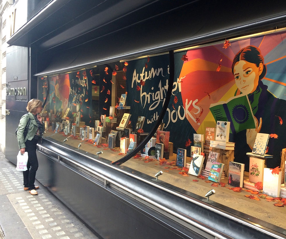
This composition works very nicely in windows, as it allows for all the important verbal and visual information to be at the top of the poster, and thereby still readable and attractive when the bottom half is masked by book displays. The imagery also contrasts in size and shape well with the books themselves. When a display is full of small, busy, rectangular objects a large, single figure works beautifully to contrast them.
I think I remember an objection to the idea of the train travel imagery from above previously was that practically, e-readers are more convenient for travel and so we are not playing to our strongest suit. If the point is raised again I plan to argue thusly: e-readers are more convenient for almost all situations. We don't sell on practicality, we sell on aspiration. I buy a paper book from a brick bookshop not because I don't realise I could get it cheaper online or more portably on an e-reader, but because what I'm buying is a slice of lifestyle, an idea of myself.
The Ravilious-based idea is unrepentantly, though I think not tackily, nostalgic. Anyway. I would of course have to swap out the literal use of the Ravilious background for a version of the composition I have drawn myself, just to pull the poster away from IP-stealing and towards reference. I'm also not sold on the wording I have come up with. It feels a little feeble and wordy at present. I have considered a simple always bring a book' or 'travel with books'.
The major challenge for this idea though is the lack of ideas I currently have for a children's version. For the last few campaigns (starting in fact with the linked Summer one), we have been moving away from having two entirely distinct suites for adults' and children's use and towards either having two variations on a single idea or even using exactly one set of posters to cover all purposes. My autumn suite had a single creative; Christmas used a single 6040 poster and a single 6020 banner, and diverged in the smaller print elements.
I am convinced this unified approach is the more successful one. But I can't quite think how I'm going to turn the adult retro-nostalgic imagery of the above adult imagery into something appealing to children.


Comments