
Character design: Good Omens
- Nov 3, 2019
- 9 min read
So I made it known at some length what I thought the failings of the Good Omens adaptation were, centred on how I though the basic misguided approach - writing without expertise in comedy as story - had let down the main characters Aziraphale and Crowley.
While I'm unlikely (though, y'know, tempted I do like needlessly splurging words in a thinly veiled move to avoid working on my Actual Projects) to write my own script, I have done some drawing/design to suggest differing approaches I would have taken in the visual storytelling and casting choices.
Part of the reason Good Omens was the first property to inspire me to actually work through to essay form was because it occupies the unique position of being drawn from something I dearly love, of massively frustrating me on every level as an adaptation and, crucially, being beloved and acclaimed almost without exception by the fan community.
With many of the things I think are bad, there's plenty of differing voices out there. Good Omens wasn't the kind of property to catch the critical eye of the voices I rely upon to satisfy my need for witty articulation (Lindsay Ellis, FilmCritHulk, Dan Olsen, Hbomberguy etc) so the only way to bleed off the cross, get-off-my-lawn-you-clueless-tumblr-kids energy was to try and write it myself.
But one of the sacrifices in making my rambling, extensive thoughts into a vaguely cohesive and readable essay was that certain areas of my disappointment or annoyance went unexpressed because they didn't really have anything to do with that central thesis.
And also, I suppose, because some of those are not frustrations that come from or can be responded to with the written word. They are frustrations niggled at by seeing a hundred pieces of Crowley x Aziraphale fanart a day on Tumblr. Spite really is the best motivator for creativity.
So consider this post a semi-tangential adjunct to that longer essay, this focusing in on the choices around visual character storytelling.
Because one of the aspects of the show I felt was honestly very disappointing was the character design.
I talked in my essay about how I felt the show was gutted by its missing of the social coding which did such hard work in the book. As I went into a little there, the costume design, and the design of the sets that defined their characters were a big part of that. I don't wish to impugn their work of Claire Anderson was the costume designer or Bronwyn Franklin the set dresser. I suspect they did an excellent job of fulfilling a brief set by the series art directors Barry Coetzer, Mark Hudson and Gareth Cousins. It’s just a brief I find... wrong.
Colours
The series chose to dress the angel in white (and cream and off-white), the demon in black. That is so profoundly boring.
Of course, any visual medium needs to include clear, even over-the-top signifiers and codes by which viewers will quickly understand certain points and ideas. But Crowley and Aziraphale are the main characters and the nuances of the angelic/demonic relationship are central to the story. These are not ideas which need to be, or benefit from being, packaged into such a flat and obvious cue.
Such unimaginative, flat choices shout "this is as complicated and weighty as a quick gag in a single-panel Saturday morning cartoon, don't worry about this". And that's not how you should be handling your most central ideas.
The angel=white, demon=black thing is a perfectly good trope to use in some visual media, those where you have to get your point across quickly and clearly, or where the primary goal is a design aesthetic: book cover art, fanart, even a series poster. It makes sense that book covers generally go for this cue.

Those posters are so gorgeous they almost make up for the series.
But even the book covers are more anchored to a sense of reality than the show costumes.
Being so broad and flat in the costuming, coding and visual characterisation of the main characters of a TV show feels frustratingly stupid. It comes back to a couple of points I made in my essay as approached that let the show down.
Firstly the failure to make choices according to any consistent story or thematic thread. In the essay I talked about the choices around the God/Frances McDormand narrator and how those didn’t create anything cohesive or interesting. Here I would say the visual cues encoded into the costuming are at odds with much else in the text. They signal simplicity and flatness in a story which aspires to doing something subversive and interesting. The obviousness invites the viewer not to care about themes which are right at the core of the narrative: what is the difference between the angelic and the demonic?
Another of the points I looked at in my essay is my frustration with the series' reluctance to hold anything back, to let a story or relationship unfold gradually, rather displaying both a desperation to shove everything up front at once, while also not having the bravery to actually go anywhere truly controversial with the relationship.
The fans and creatives might talk about significance in the show - a shot of a black and white swan looking like a mated pair here; a heart-eyes shot of Aziraphale there - but in terms of what is on screen there is never actually any development in the relationship. The Aziraphale and Crowley we see at the Fall of Man are the same characters in the same relationship we see eating at the Ritz at the end. You can imagine in those details and meanings all you want but as long as all you've got is deniable subtext, it’s just fanfiction.
The choice of colour-coding is part of the same problem. The clothes don't tell a story or convey a character. They express a simple, easily graspable and likable idea that won't expand or change through the series.
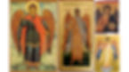
But I'm certainly not saying that the characters shouldn't have been visually coded for their angelic natures! I just think there's far more interesting and communicative traditions of angelic art to tap into than white and black.
I would have looked to Byzantine art and the tradition that has given us of jewel-toned angels with plenty of gold leaf.
Aziraphale
In particular, I would take the most beloved combination of orange, blue and gold and use that for Aziraphale. As the straight-down-the-line, un-fallen, complacent angel, the most angelic palette makes sense for him.
It also is a palette I think works rather well for his human appearance.
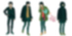
My fancasting for Aziraphale - like many before me - is Richard Ayoade. His personal style includes a fondness for colourful suit/shirt combos in tones that match the Byzantine palette pretty well.

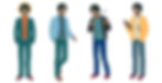
So Azirapahle's style would be a version of that. A Hawes and Hudson look, very Jermyn Street. Not old-fashioned, but very well made, the colour and sharpness of line undercutting just how expensive these clothes are.
So here's a few outfits from most to least dressy l-r.
And that's all in line with the life Azirapahle is living. My motivation is not just to look to the characters' celestial nature. Their clothes should tell the story of what kind of people they are. After all, the characters’ story motivation is based around enjoying human, Earth-based life. that's rather meaningless unless we get a sense, specifically, of the lives they are living.
The visuals, especially something so omnipresent and personal as clothes, can - and should - tell a whole story.
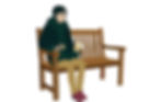
A series can and should heighten but there’s a difference between stretching and breaking a connection to reality. For example, Aziraphale’s on-screen-bookshop was an enormous, genteel cavern the likes of which does not exist in central London. You might say, but he’s an angel, he has miraculous power on his side. But that’s an in-universe handwave of a meta problem. The lives of these characters needs to be tethered to reality for us to engage with them and their motivations in the necessary way.
So my version of the bookshop would be more like a Cecil Court or Charing Cross Road style establishment. Small, specialist-looking, messy, shelves including the actual books you would tend to find in such shops - paperbacks, 20th century editions, not just leather-bound tomes.
It would look a bit like the most famous fictional Bloomsbury bookshop too: Black Books. And by this reference point as well as a few other cues, I would include a little of the Bernard Black in Aziraphale. It's certainly there in the book.

The human life Aziraphale so enjoys is a very specific one. He's the kind of young-middle-aged, upper-middle-class, intelligent man that the book industry is very kind to. His actually-an-angel nature is analogous to independent wealth in some way, there's something about him like there is many of his type that mean the troubles of running a small business in a precarious industry are never quite serious to him. He loves the lifestyle of going to publisher events, taking the GWR sleeper to the Edinburgh Book Festival, sipping Pimms at Hay-on-Wye, catching up with the book world gossip over breakfast at the Wolsey with the manager of Hatchards.
There’s the tie to the Cold War stuff there too, location-wise. The suits tie us to Saville Row and Jermyn Street and that’s spy territory, in fiction and reality. Even now. Alexander Litvinenko used to meet his handler at the café of Waterstones Piccadilly. He was poisoned at the Itsu a few doors up from Hatchards. It’s a three-minute walk from St. James Park.

So you can bring in a touch of a broad Cold-War-era-ness into some of the character design: wide-collared trench coats, slightly Cuban heels etc.
Crowley
Meanwhile, Crowley's ties to a social class-type seem less important to me. Partly because Crowley is more the protagonist of the pair, the more active for the bulk of the story, and so benefits less from that kind of shorthand.
But also Crowley is a social type that has lost a little currency in the years since the book’s publication – a cool yuppie; a someone for whom rock n’ roll, punk rebellion were always more of a personal affect than tied to any kind of ideology. Fandom likes to cast Crowley’s falling ‘because he hung out with the wrong crowd’ as something quite sweet, but to me it’s more venal than that. He’s prepared to go along with whatever serves him on the most shallow front.
A bit like Vince Noir in the Boosh, though perhaps somewhat worldlier and less vapid. My fancasting for Crowley, then, is Noel Fielding.
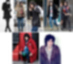
I'm selecting a particular type/era of Fielding couture there. The darker/gothier aesthetic, obviously. and something about a mix of textures feels appropriate. It feels like it makes solid character sense that Crowley - both as a snake and a citizen of Hell - would be permanently chilly on Earth. There's also a big 70s/early 8os influence which again ties back to the Cold War vibe.
I’d still be drawing on the Byzantine aesthetic for Crowley but his incoorperation of it would be subject to more nuance and influence than Aziraphale’s. Firstly Crowley is fallen so needs to be subverting the most obvious palette in some way. He also has a couple of animalising cues that Azirapahle on the page does not: Crowley is a serpent. The serpent. But the winged angel notes also tie him to bird motifs.
But my principle influence for Crowley is this alterpiece by Jaume Huguet depicting the archangel Michael:
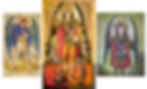
And the mini-tradition it follows in of depicting Michael with peacock-feather wings. The colours and motifs seem very right for my Crowley. The crimson/green/teal palette with yellow highlights fell gothy and Byzantine at the same time.
And thinking about jewel-tones/serpents/exotic feathers puts me in mind of the feathered serpent gods of the Aztecs. I can definitely image Crowley spending some time as a false idol.

So I’ve found a reference field that finds a cohesion in the different aspects of Crowley’s nature and suggest in themselves some other aspects of his history: perfect.
So a Crowley of mixed feathery, scaley and smooth textures feels apt, and the palette is crimson, green, teal and yellow. Very dark greens instead of true blacks.
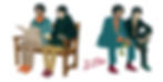
So the two brought together (and that Black Books influence):

So much for the human manifestations.
Angelic forms
It might not astonish anyone to learn I don't think much of the show's handling of Aziraphale and Crowley's transformation into their celestial versions, or the design thereof.
Like the white/black palette choice it just feels like the most unimaginative and most uninspiring-of-imagination choice possible. They are the same, but with bird-like wings sprouting from their backs.

The wing design works better in the opening with the robes, but storytelling-wise that's kind of an issue in itself.
When Aziraphale and Crowley decide to face Satan in a probably-fruitless attempt to defend a handful of humans its the character-development climax of their story and their transformation into their own shapes is a fantastic visual to match the emotion. If the design has already been shown - and worked slightly better the first time - it loses a lot of impact.
In the book, the transformation is expressed briefly but vividly thus:
The coats of Aziraphale and Crowley split along the seams. If you were going to go, you might as well go in your own true shape. Feathers unfolded towards the sky.
I'd take a cue from the line about the coats tearing. I like the idea of the clothes being part of the transformation. This shouldn't feel like two people gaining wings but a transmutation into another form. So I like the idea of the fabric of their clothes ripping and twisting into the angelic clothes and wings:


NB: this post originally published 15th Feb 2020 but date attached changed for reasons too uninteresting to get into.